Andover Surgery Center
Web DesignServices Provided Custom Website Design, Web Development, WordPress CMS, Mobile & Tablet Compatible Web Design, Website Hosting
Project Details
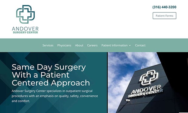
Clean. Calm. Beautiful. World Class.
Those were the words used to describe the environment of the surgical center, and the attributes we wanted to communicate to patients through the website. We were excited about the possibility of creating a sparkling new site from scratch—a clean slate.
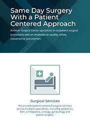
Rather than the standard medical blues, we went with a modern yet serene palette of soft mint green, grays, and teal and ocean blues. It immediately sends the message to patients that this surgical center offers a distinctive experience, where they will receive the best care but also a comfortable and calming atmosphere. The text is crisp and clean, with easy contrast and sizing to make it readable for patients.
The overall effect is beautifully cool, open and soothing—a breath of fresh air.
UX is of the utmost importance on a medical facility website. Patients need easy access to forms and information that will make their procedure as smooth and stress-free as possible. Potential patients often do exhaustive research, and being able to find quick answers to their questions can make a difference in the provider they choose. We called upon our own knowledge of UX design as well as medical industry best practices. We also helped the client refine their copy and provided SEO-informed headlines and metadata.
Andover Surgery Center now has a beautiful, patient-friendly website to match its facility….delivered on time!


