Scholfield Honda
Web DevelopmentProject Details
The primary objective for the redesign of ScholfieldHonda.com was creating a site that was completely mobile and tablet responsive. The other objective was to merge three company websites into one with a new, custom content management system. That said, the site build started with a revamp of Scholfield’s site structure and a clean-up of all the site copy.
The size of the previous site and all the assets it housed also took a toll on its site speed. Every time a visitor jumped to a new page or clicked on a link, the server had to render the requested page or asset from scratch—creating a delay. To improve the site speed, our team used a cutting-edge JAM stack to pre-render everything into static files. This now provides an instantaneous browsing experience while also eliminating the possibility of a security breach.
As expected, vehicle inventory takes up the majority of the 500+ page website. Because inventory creates a large influx of new site traffic, and of course, the opportunity for new sales—the updates here were critical. Now, the vehicle listings are larger and more focused on the key elements people look for when browsing for a new vehicle. This includes a sorting feature that allows people to filter by more features, making the search process more precise.
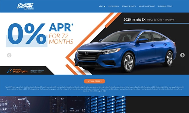
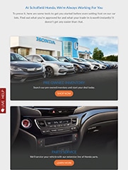
Visually, Scholfield is known for its flagship blue and orange, but it also has distinct brand standards that must be followed as a Honda dealer. With those in mind, our team delivered a new, modern website with a high-end feel and better usability!


